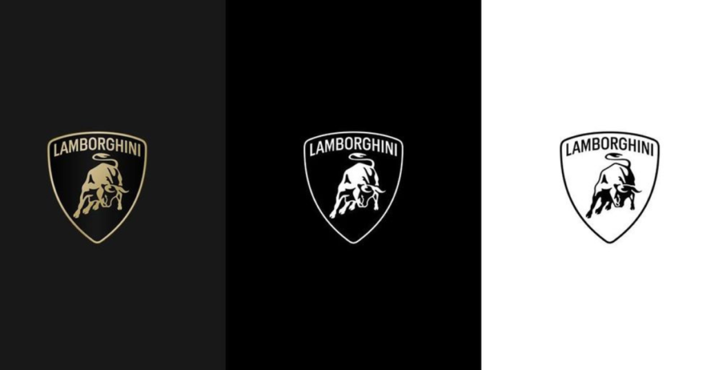
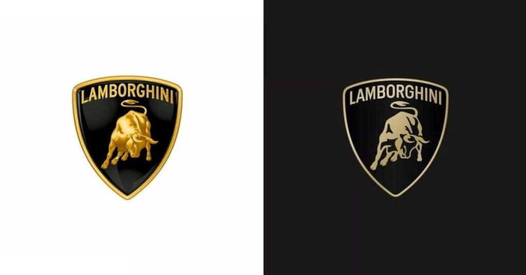
Lamborghini, the renowned Italian luxury sports car manufacturer, has unveiled a modernized logo, marking a departure from its previous design that has remained unchanged for over two decades. This move is in line with the company’s new strategic vision, aimed at aligning its visual identity with its core values of bravery, unexpectedness, and authenticity. As part of its broader transformation strategy, Direzione Cor Tauri, Lamborghini is committed to sustainability and decarbonisation, paving the way for a future that balances innovation and environmental responsibility.
The updated logo showcases a wider Lamborghini font than the previous version, paired with simple but striking color choices. The main colors are black and white, representing the brand’s strong identity, with yellow and gold used as accent colors to bring energy and uniqueness. Noteworthy changes include the iconic bull symbol, a symbol closely associated with Lamborghini, which has been redesigned to stand alone on digital platforms, separate from the usual shield design, to increase its visibility and effectiveness.
Lamborghini has expanded its brand identity beyond its logo by introducing a custom typeface and set of icons that mirror the unique design elements of its vehicles. The typeface and icons, created in partnership with Lamborghini Centro Stile, will be consistently integrated across all digital platforms to maintain a strong brand image and cohesive visual language.

As Lamborghini embarks on a new era of innovation and progress, the company’s strategic evolution is marked by a sleek, modern logo that reflects its renewed commitment to cutting-edge technology and bold ambition. The updated emblem heralds a significant shift in Lamborghini’s positioning, aligning with the objectives outlined in the Direzione Cor Tauri program and paving the way for an exciting new chapter in the company’s history.
Lamborghini is looking to motivate upcoming generations by accepting the while upholding its challenging norms and exceeding limits. The updated logo symbolizes the brand’s dedication to advancement and eco-friendliness, marking a fresh phase in its rich history.
What are your thoughts on the new logo? Let us know in the comments below.


